02. Color
ND197 C2 L3 A03 Color V2
Color
Color is difficult to do well.
The following tools can be used to help make better decision about the choice of color in your visualization.
This tool provides a very small selection of color palettes. Provides you with the options of ensuring the colors are color blind friendly and that there is enough contrast for people to easily distinguish between one color and another.
- Color Brewer
- Data Wrapper
- Viz Palette cited above in the video was developed by Susie Lu and Elijah Meeks, Senior data visualization engineers at Netflix. Please visit the website to use the tool.
Here is a tool developed by Cynthia Brewer to help us make better decision and avoid common mistakes.
Cynthia’s tool provides a very small, but useful selection of palettes. You can ensure colors are color blind friendly with the check of a box while also making sure there’s enough contrast between the discrete color categories.
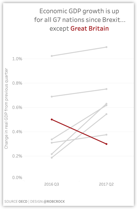
You can also use color to grab the audience's attention. This can be done by muting everything other than the point you want them to pay attention to, such as in the example below.

Few roles for plays for visualization
Colors help with each of these:
- Encoding
- Mood
- Identity
In the next few pages, we will cover each of these in depth.